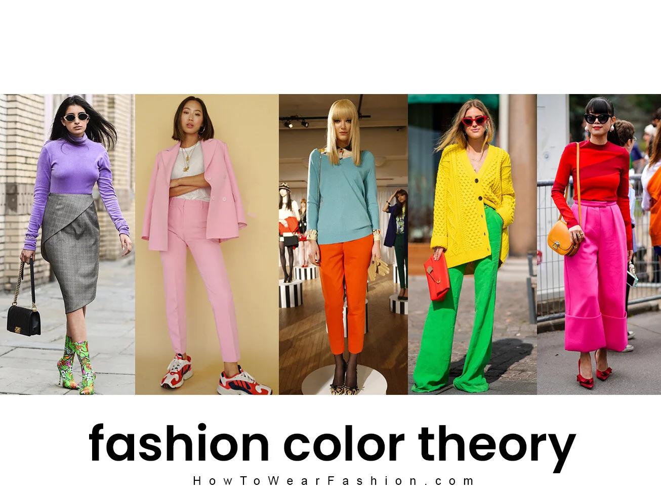
Color theory
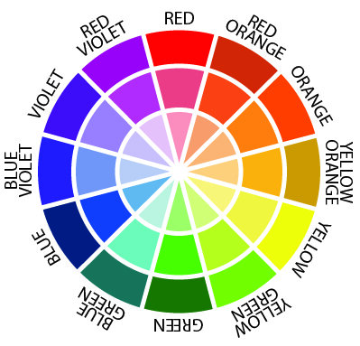
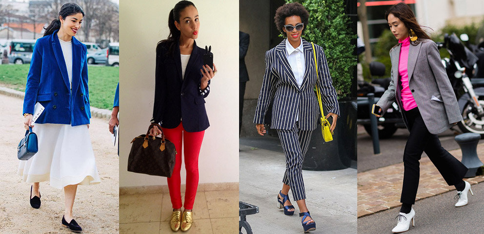
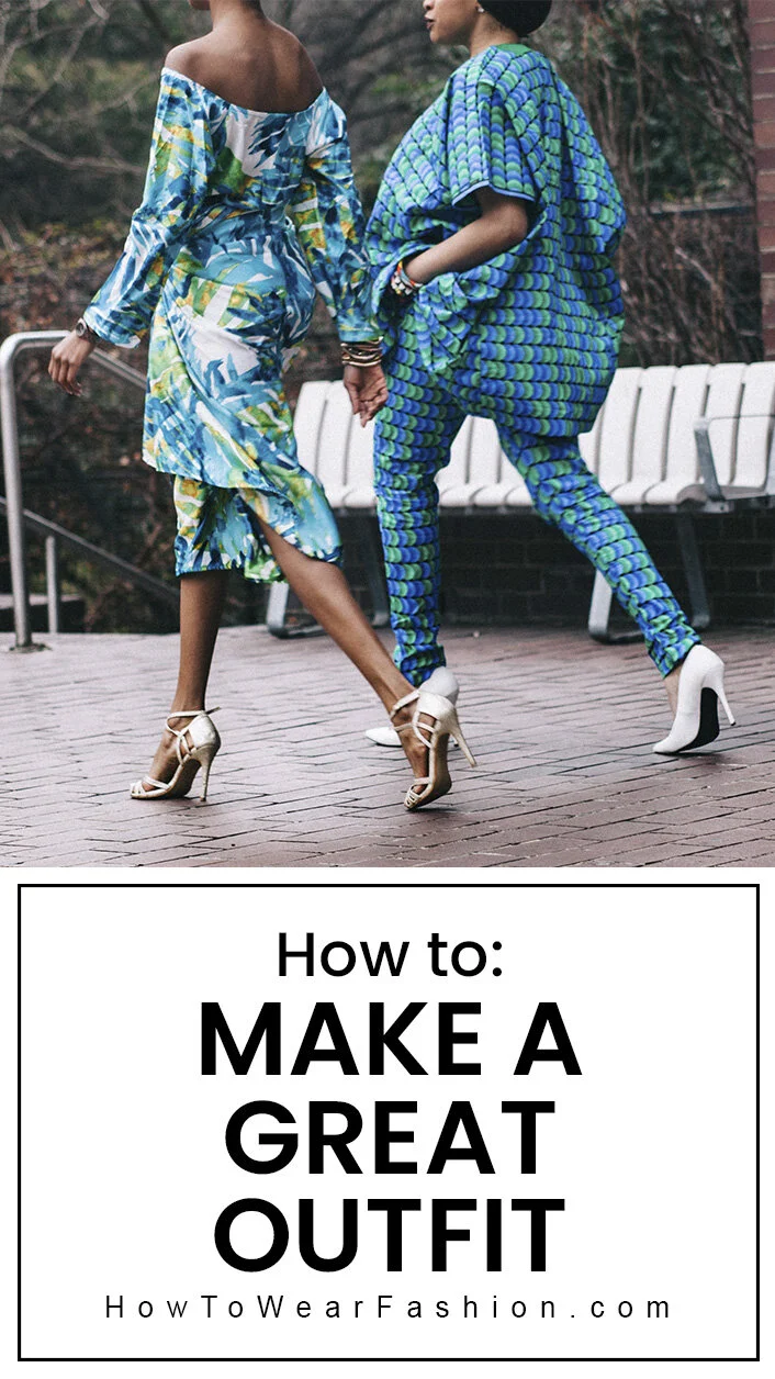
Knowing how to use color theory in fashion is huge to looking good! Easily do this by becoming friends with the color wheel. ❤️🧡💛💚💙💜 It may seem a little intimidating at first but don’t worry, you don’t need to go to art school to do it! There are just a few main points to learn (and eventually memorize) that you can immediately start using when getting dressed every day. Reference the color wheel here as needed, or order a color wheel to keep in your closet (this one is good and cheap).
Below, we’ve outlined the different options for color combinations you can use in outfits — analogous, complementary, triadic, tonal, monochromatic. Note that the first three color combos (analogous, complementary and triadic) can be worn with shades of white, gray or black in your outfit since those are visually “void of color” neutrals that don’t count as colors themselves. But the last two color combos (tonal and monochromatic) have a more narrow color focus so they don’t usually lend themselves to adding neutrals in the outfit.
The color wheel
Let’s look at the color wheel and discuss the key points of using color theory in fashion.
Analogous colors
Analogous colors are hues that are adjacent to (next to) each other on the color wheel. The colors are similar to each other — in other words, they blend with each other when paired together. Examples: pink and red; blue and purple; green and blue; orange and burgundy. The feel here is a cohesive and harmonious soft gradation of color.
Complementary colors
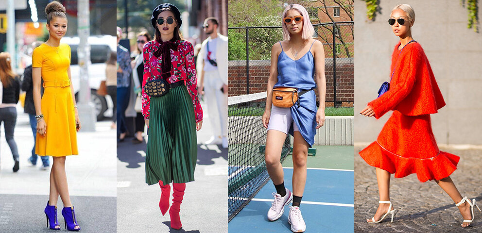
Complementary colors are colors exactly opposite each other on the color wheel. These contrast each other — hence making each other seem more vibrant when paired together. Examples: yellow and purple; green and red; blue and orange; blue-green and red-violet. The effect is a really popping contrast of color that creates a sometimes electric, high-voltage look!
Triadic colors
Triadic colors are three colors spaced equally apart on the color wheel. Being equidistant on the color wheel, these colors balance each other and create harmony. Examples: orange, purple and green; red, yellow and blue. This is a multi-colored but balanced type of look!
Tonal
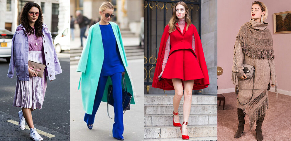
Tonal colors are different shades of the same hue, the same color. For example, shades of red that could be combined in an outfit are pastel pink, magenta pink, bright red, and/or deep burgundy. These are all different tones, different lightness/darkness of the color red. The tonal look is fun and pretty easy to do! It gives you a pretty style that’s a bit more subtle than the monochromatic color scheme.
Monochromatic
A monochromatic color scheme is similar to tonal but even more selective in color. It’s wearing the same shade of a color, from head-to-toe — like all bright red, for example. It’s a little harder to pull off because you need a generally precise match of color from item to item. Some colors are easier to do with this look, such as black, white, or beige. The monochromatic look has been really trendy lately and can be seen on many celebrities. It is like you dipped yourself in one single color — any color you’d like to adorn yourself with from head-to-toe! This gives a body-lengthening effect! And, it’s an “expensive” look because every item you’re wearing appears to be bought for that outfit alone to be worn as a set. Achieve some interest in your outfit by combining different texture or pattern.
accent
The simplest way to use color in an outfit is to strategically use a pop of accent color! Especially a good choice for work (since a rainbow of colors usually isn’t the best choice there), go with a single color paired with neutrals. A base of white, cream, navy, gray or black sets off a pretty color and gives a strong, conservative look that is still highly stylish.
